Every company needs a professionally designed presentation because this marketing tool is the first point of contact during the negotiation process with clients/partners/investors. Moreover, the quality of the offered product or solution is being assessed based on how the product is portrayed.
The presentation design went through different phases within the last two decades. First it was the so called Apple style, which became famous after the notorious presentation given by Steve Jobs, introducing the first iPhone. Well, today it is still considered as one of the best pitches of all time, but after 5 years of euphoria and significant demand on the US market for this design style, it followed it natural curve and practically came to its end. The main reason for this is the fact that most of the entrepreneurs finally understood that they are not Steve Jobs, who was able to fill a hall with 50k audience just with his presence. Frankly speaking he didn’t even need a visual aid behind him on the wall. A few years later a new fashion undertook the global market – the so called ‘less is more’ style but it shared the fate of the Apple style. The reason for this is that from psychological point of view, it is not how human brain works. A presentation should astonish and impress, so the attendee can remember the main key points, associating them with the respective visuals. A recent study shows that 70% of the content of pitch decks with just text on a plain, one color background slide with some icons here and there, is being forgotten after half an hour. That’s why the saying ‘A picture speaks more than a thousand words’ exists. And because of this, software giants like Microsoft and Apple invest hundreds of millions of dollars to introduce new features and visual elements in every new version of PowerPoint and Keynote. Otherwise we would just design our presentations in Word and Notes.
The design of an engaging pitch deck is similar to the preparation of a delicious meal. The right balanced recipe has to be followed — a cup of stock images, a teaspoon of infographics, and a pinch of business icons. The difference lies in offering your target audience a fast food meal versus a Michelin 3-star cuisine.
Realizing the above-mentioned, many entrepreneurs apply to professional PowerPoint designers regarding the design of their corporate and marketing presentations, sales and investors pitch decks. Unfortunately, before entering in such a relationship, they forget to ask the designers if they have ever given a presentation, to understand if they were tested on the battlefield, if they felt the pulse of the audience, reacting on their visuals. And thus sometimes the entrepreneurs leave the faith of their business success in the wrong hands.
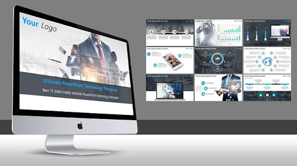
This is of great importance especially today during the boom of the disruptive technology, where most of the projects are based on unique ideas and only the entrepreneurs, who created them, know how to present them in a best way in terms of which are the key messages and how to emphasize them visually. The solution is to find a professionally looking PowerPoint technology template, to roll up sleeves and to create an engaging presentation that will impress clients and partners.
Many of you will ask: “But why exactly PowerPoint?” Well, because PowerPoint still rules! And the reason for this is that if a presentation is designed properly, it is totally compatible with the other two big tools — Keynote and Google Slides. You can open and edit any ppt file via Keynote and Google slides, but can you open a .key file in PowerPoint?


