With the growing number of tablet users and e-readers, the popularity of e-books is increasing day by day.
According to an estimate as of 2018, approximately 90.5 million owners of e-readers in the United States, and that number is expected to increase to over 93 million by 2020.
In terms of marketing, e-books are considered to be one of the best content assets of the lead-generation, and with the increase in the mobile world, this makes them an even smarter choice from a marketing perspective.
As a piece of long-form content, a lot of work goes into creating a well-conceived Marketing e-book. If you are a designer and are confused about how to create an e-book, this article can be of your help. Here, we will discuss 6 of the many essentials elements that make up a useful marketing e-book
An Interesting, Descriptive Title
The title is often the first thing a reader notices and judges before clicking on and reading an e-book. It is an essential element which cannot be missed. Consider your e-book title as a piece of art, and go creative with it. Few things to keep in mind when deciding a book title are, it should be interesting to catch a reader’s attention, and it should be descriptive indicating the reader what they will be reading about in the e-book. Unlike blogs, e-books are high-commitment pieces, this is because of the length of their content, so before you a reader starts reading your e-book, and you must make sure to establish its value in a constraining and compelling manner. Your book title should convince the reader that the e-book is an interesting piece to read.
2. A Visual Cover
There is saying, ‘Don’t judge a book by its cover,’ but most people do the opposite, if they look at some book cover and not find it interesting, they don’t bother going into any further details. The same rule applies for an e-book; you have to make sure your e-book’s cover is visually tempting and coexists with your brand style. The world we live in today is all about visuals, several websites, like Pinterest and Google, and social media networks like Facebook and Instagram, are emphasizing more and more on visual content. It only proves the importance of visuals and how important it is to focus on it while designing a visual book cover. An ideal cover should have an easy to read title. It should include brand elements based on the brand’s style guide, and it should feature an image.
3. A Table of Contents

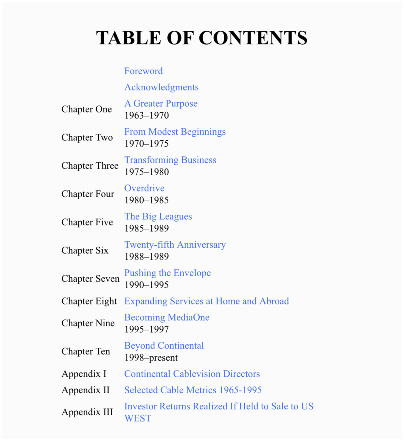
Any book whether it’s print or digital should have a table of content. It helps readers to understand how the e-book has been organized and also helps them in quickly referring to specific chapters of the book. For example, a reader might not be interested in reading the entire book, but a few chapters, a table of contents would help him/her to do this easily without going through the hassle of turning every page. You can make your e-book even more user-user-friendly by using programs like InDesign; these programs allow you to hyperlink sections/chapter, creating an interactive table of contents. When the reader clicks on a link, they are taken to a specific section/chapter. It makes reading both exciting and fun for the user.
4. Chapter Title Pages
Chapter title pages allow you to differentiate one chapter from the other, giving users a clear manifestation of their progress through the book. It also divides the book into different sections and indicates the reader of what they will be reading about. Having chapter title pages also helps you in creating a table of contents. Like we mentioned above, not everyone is interested in all chapters/sections of a book, so they can read up the chapter title pages from the table of contents, and decide what they are interested in reading.
5. Social Sharing Buttons
By including Social Sharing Buttons in your e-book are one great way of allowing people to promote your book. As social media is a valuable tool for promoting content, adding social sharing buttons in your e-book lets a reader share your book on platforms lie Facebook, Twitter, LinkedIn, etc. Having these buttons on the landing page of your e-book is a great idea, but wouldn’t it be better if you added these social sharing buttons on other pages of your e-boom as well? Some readers might not want to share your e-book before they have read it, because they will not be sure if they like the content or not. Adding buttons to each page of the e-book will allow them to share the book at any stage of their reading. You can add these buttons in the header or the footer, and if your content is gated, make sure to share links to the e-book’s landing page.
6. Printer/Mobile-Friendliness
Although your e-book is a digital publication, giving the readers an option to download the file in the form of PDF is always a good idea. A large population of people download e-books and then prefer them to print onto a hardcopy so that they can read it on paper instead of a screen. This is the reason why it’s essential for you to make sure your e-books are print-friendly. Look for guidelines to design an e-book that can also be printed quickly, avoid designs and layouts that don’t turn out well on paper. The best way to analyze if your e-book is print-friendly is to do it yourself.
Because a great percentage of people read on their mobiles, it’s also important that your e-book is mobile-friendly. When designing an e-book make sure its PDF views well on smartphones and other gadgets like iPads and tablets.
There were many of the 6 essentials that go into creating a well-conceived book. If you plan to design one, make sure you include all these points.


